
Guest article provided by daslia.com
Your travel blog is your digital home base, a place where stories of adventure and discovery come to life. But before a reader dives into your tale of hiking the Inca Trail or getting lost in a Tokyo market, they see your design. The colors, the fonts, the overall feel—your visual brand is your first impression. A cohesive and intentional design builds trust, makes your blog memorable, and keeps readers coming back.
The good news? You don’t need to be a professional designer to create a stunning blog. By drawing inspiration from your own travels and following a few simple principles, you can build a visual identity that truly captures the spirit of your wanderlust. Let’s get started.
Evoking the Journey – Crafting Your Color Palette
Color is emotion. It’s the first thing a visitor notices and it sets the immediate mood for your content. For a travel blog, your color palette should reflect the essence of your adventures.
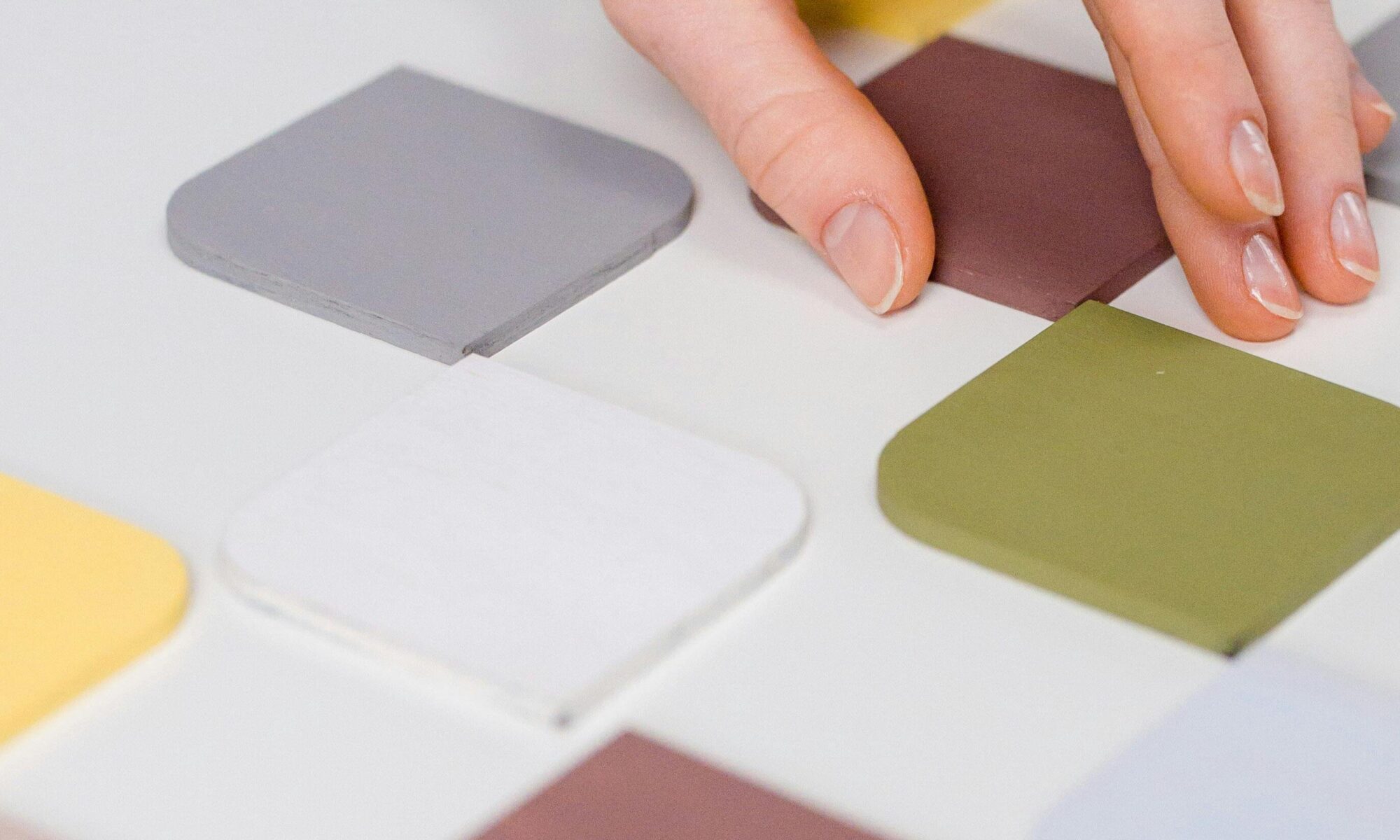
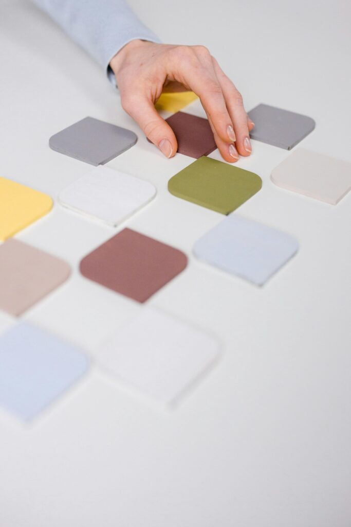
- Draw Inspiration from Your Travels: The best inspiration is already in your photo gallery. Look at your most iconic travel photo—a turquoise ocean in Thailand, the earthy red rocks of Sedona, or the deep greens of a Scottish highland. These are your authentic colors. A palette drawn from a personal photo is unique and instantly communicates your niche.
- Understand Color Psychology:
- Blues: Calm, trustworthy, serene. Perfect for blogs focused on oceans, lakes, relaxation, and spiritual journeys.
- Greens: Adventure, growth, nature. Ideal for hiking, camping, eco-tourism, and outdoor enthusiasts.
- Earth Tones (Tans, Browns, Terracottas): Reliability, warmth, rustic charm. Great for historical travel, backpacking, and “off-the-beaten-path” content.
- Vibrant Yellows, Oranges, Reds: Energy, excitement, passion. Use these as accents for blogs about festivals, food tours, or vibrant urban cultures.
While you can extract colors manually from a photo using editing software, this process can be time-consuming. For a quick and precise solution, you can extract a perfect color palette from any image using a dedicated tool. This ensures your palette is professional, balanced, and ready to use.
Setting the Tone – Selecting Your Font Pairings
If color is the emotion, typography is the voice of your blog. The right fonts ensure your stories are not only beautiful but also a pleasure to read.
- Choose a Personality:
- Serif Fonts (like Georgia, Times New Roman) feel classic, authoritative, and trustworthy. They are excellent for blogs heavy on long-form, narrative storytelling, especially for history, culture, or luxury travel.
- Sans-Serif Fonts (like Arial, Helvetica) are modern, clean, and minimalist. They convey a sense of simplicity and adventure, perfect for modern travel tips, city guides, and outdoor blogs.
- Script & Decorative Fonts should be used sparingly and only for headers. They can add a personal, elegant, or playful touch, but are often difficult to read in large doses.
- The Golden Rule: Pairing Fonts: The key to good typography is contrast. Pair a distinctive font for your headers with a simple, highly readable font for your body text. This creates a visual hierarchy and guides the reader’s eye. A common and safe strategy is to pair a Serif header with a Sans-Serif body (or vice-versa).
- Avoid Common Mistakes: Don’t use more than two or three fonts on your entire site. Never sacrifice readability for style—if it’s hard to read, people will leave.
If you’re unsure where to start, you can discover harmonious font combinations for your blog by browsing pre-designed pairings. It takes the guesswork out of typography and provides instant, designer-approved inspiration.
Putting It All Together – Practical Implementation
You have your palette and your fonts. Now, let’s make your blog cohesive.
- Create a Style Guide: Even a simple one! Note your hex codes for primary, secondary, and accent colors. Write down your header font and body font. Use this guide for everything: your blog, your social media graphics, your newsletter, and your Pinterest pins. Consistency is key to brand recognition.
- Apply to Your Website: Most blogging platforms (like WordPress, Squarespace, and Wix) make it easy to change colors and fonts site-wide in their theme settings. Input your hex codes and font choices to see your new brand come to life.
- Design a Mock Header: See how it looks! A simple mockup can help you visualize the final product before you commit to changing your live site.
Your travel blog is a reflection of your unique journey. By investing a small amount of time into your visual brand—choosing a meaningful color palette and clear, complementary fonts—you elevate your blog from a simple diary to a professional, engaging destination. It’s the perfect way to ensure your design is just as unforgettable as the stories you tell.
Now, go inspire the world to travel, one beautifully designed post at a time.